Overview
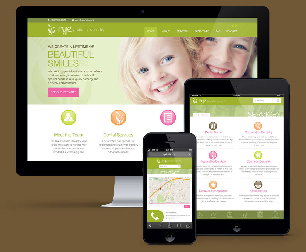
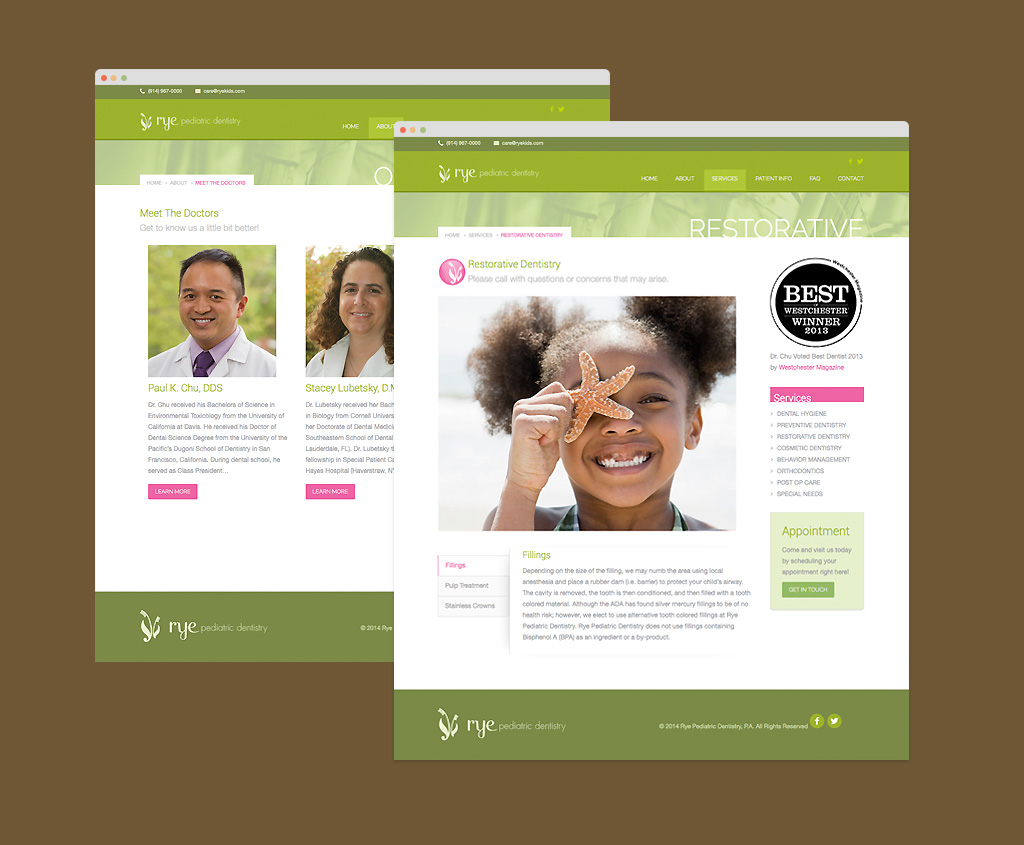
Rye Pediatric Dentistry, stemming from New York, came to us looking for a website enhancement and overall brand update from their out-dated look of the past 10 years. We decided that it must be something user-friendly, modern and very easy for the owner to manage and update content himself. We wanted to enhance the warm and welcoming qualities to attract a demographic with young children and incorporate some more playful elements and pops of colors like pinks, oranges and yellows. We also created a slew of custom icons that can interplay within the other marketing materials.


